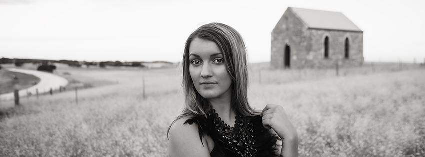
I have been asked to give you my top ten tips for getting better photos of your bodypainting.... which is something I have done a lot of over the last few years.....so this is especially for the readers of Face magazine....I hope this makes some sense to you. At the end of my list I'll post some photos because most photographers and all artists are such visual people and it will help it all make sense :)
1) Photograph every piece of work you ever paint.
This may seem obvious but its the most important. Even if you don't like what you've done or you haven't finished....take a photo or 10 anyway. With the nature of digital photography it is cheap and easy and you will be able to create a file of your progression. If you have only painted the front...thats fine. If you have only finished half the front then take a detail (a close up of your favourite piece of the work)
2) Use whatever device you have!
Don't wait until you can purchase your dream camera. It doesn't matter what you use to take your photo. If you only have your phone or tablet then use them. They are much better than nothing and you can get a perfectly adequate shot from your phone. You really only need a DSLR (digital camera with a lens) if you are planning on printing it in your portfolio or using it as an exhibition piece. For web use you can use a iphone pic if its taken well enough.
3) Download a good camera app for your phone and tablet shots.
Instagram is probably the easiest one but there are many that will allow you to brighten up an image. I use Camera + which allows me to edit photos before saving them but Snapseed is another favourite. I have a little folder on my phone with about 6 different cameras and use them all depending on what suits best.
4) Find some shade.
Bright sunlight is a photographers enemy...if you have no choice and are outside in midday sun...use Hipstomatic with a bright colour film. Otherwise move into the shade and face your subject so that they have the softest flatest lighting you can find. For example if you are under a verandah...face your model square on towards the light and then move them backwards. The further away from the lightsource the softer light you will have. If they are square on to the light...it will be flat and even. If you turn them slightly to either side you will create a soft shadow and add interest. Experiment with this to see which you prefer. Its exactly the same if you are inside with a window except that you will have less light and it will diminish quicker as you move back.
5) Find a plain spot of wall.
You don't need a very large spot to create a neutral background. Make sure you have 20 inches or so on either side of the model. This way all the focus will be on the model and your eye wont be distracted by stuff in the background
6) Hang up a sheet if there is too much stuff in the background.
You can usually find somewhere to pin it up on so always carry pegs and a sheet....worst come to the worst....use the dust sheet that you have worked on....make sure the model is not standing directly in front of it....move him/her as far in front as you can while still keeping some space on the sides and top. That way it will blur up in the background. If you stand too close to the backdrop it will be in focus as well and not look as good.
7) Focus on the eyes...always.
Try to get the focus to catch on the eyelash area because it will not only keep the eyes sharp but will help with the exposure. The camera sensor sees grey so if you are focused on a black and white area at once (like the black eyelash and the white of the eye) then your exposure will in theory be spot on too. If its a detail of the paint focus on the thing you want to be the main subject and if its a contrasty area then all the better.
8) Experiment with zooming right in and zooming out incorporating the full body.....always experiment....there is nothing to lose.
Play with posing and always try and flatter your subject.
9) Exposure...
To start with, use the preview to view if its too light or too dark. If you have managed to get nice flat lighting then it should work fairly well....if you have a bright light behind the subject then he/she will be too dark. If this is unavoidable then zoom in onto the body, cropping out the backlight in camera and the device will meter and lighten the body for good detail. If you have a good SLR then use it on manual or if you can't then aperture priority is the next best thing. Aperture is a whole subject of its own and maybe will discuss it in depth in another post.
10) Edit the photos.
Use a phone edit if its a phone pic and an editing software if its a camera shot. By the nature of the beast most photos will come out of camera needing a contrast boost and a bit of lightening or brightening. Photoshop elements is a easy software to use for your camera shots....or the above ones already mentioned for phones and tablets. If you know what you are doing the photoshop has never been more affordable (by subscription) and lightroom is also a great editing programme. It does take time to learn both of those programmes but its essential if you are going to be doing any serious photography. However never overdo the editing...and if in doubt go as close as you can to where you can't tell its been edited.
PS Print your best work....its the only safe way to keep a record!
Hope thats of some help I will attach a couple of shots from the same shoot. One shot is taken with the phone and the other with my prof camera. Both are under a verandah, facing the light. I found a very small clear space of rendered wall and could not bring her forward because there wasn't enough space around her. She has been posed focusing on flattering her rather than showing a super clear picture of the artwork because overall that works better.
Many thanks to our model Anya Anastasia and to Wendy Fantasia who painted her beautifully for the Hills Secret Garden
For more photographic art tips like my facebook page :)

